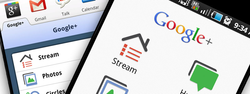
Previously you would have had to ask an Android user just how good Google+ can be on mobile, at least until the iOS version was released today. The mobile experience is, in my opinion, the most compelling reason that Google+ will build a userbase. As good as the the mobile site is, the app Google released for Android handsets and the iPhone is light years ahead of both the mobile site and its competition, to download the best apps go to bluestacks download and start there.
Facebook versus Google+

The Facebook app for Android does not look good next to the one for Google+, and is barely usable in most situations. Unlike the Facebook app, Google+ starts fast and is easy to navigate through. Both apps start on a screen of buttons, linking to the app’s functions, but Facebook also tries to display recent photos from your stream, which in some situations kills performance and gets in the way of doing whatever task I opened it for in the first place. I can’t say that Google+ has replaced Facebook for me on my phone, because I stopped using Facebook on mobile ages ago. It really was that bad.
Living with Google+

Basic activities such as posting updates, images and locations are integrated and painless, though there is no option to attach links, even using contextual sharing through the phone’s browser. Selecting the Circles to share the post with is simple, and managing them through the app is easy.
Life Through a Lens List Circle
Circles are cool. They are a great way to manage who you talk to and separate people into discrete groups by relationship, interests, location and hair colour, and keep these groups up-to-date as circumstances change. However, no-one is ever actually going to do this as the time needed grows with the size of one’s social network, and those that try will go mad, or give up.
I only ever seem to use just two of the Circles I’ve created: everyone I’m connected to on Google+, and everyone except those that post too much. It is the second Circle I spend all my time in, which is why it’s frustrating when Google+ defaults to the unfiltered stream, and even more so on mobile.
Google+ supports lots of text, images, videos and comments, and the number of updates per pageview is low, especially on mobile. Consequently, noise management on Google+ is important, maybe even more so than on other platforms like Twitter.

In the Google+ mobile app the stream has three default views: Nearby, All Circles and Incoming. Nearby is for public posts near where you are, Incoming is for people who are not in your Circles but who are following you, and All Circles is for all of your Circles.
The app lets you swipe from one to other, which in itself is cool, and you can add additional Circles to these three as well. But it will always open on All Circles. This is very annoying, especially when my 3G decides the year is 1999 and it therefore doesn’t exist.
Ideally Google+ also needs to allow its users to create Circles based on who isn’t being followed rather than who is. It would be even cooler if you could create Circles based on which Circles to exclude. A ‘Stream’ minus ‘Noisy People’ Circle would be cool, as would ‘People I’ve Met’ minus ‘Work People’.
You could of course set up a Circle including everyone except the noisy people, and this would be a good idea too, assuming you are only connected to 20 people. Circles managed by inclusion really don’t look like they will scale well.
And of course, Google+ still needs to let the user decide what they want their default stream to be.
Group Messaging via Huddles
There is only one thing that might make it worth micro-managing Circles: Huddle. Google+’s group messaging feature is actually a good reason to go to the effort of creating and curating small Circles of people who occupy a very specific part of your life, just so you can message them as a group. From your phone. Easily.
TL;DR
- It is better than the Facebook app. By lots.
- The app is stripped down compared to the desktop version, and does not include Hangouts or Sparks, but does include Huddle.
- Circles sound cool, until you try to manage them over time.
- Not being able to choose a particular Circle as your default stream is annoying.


